
By Lane Florsheim
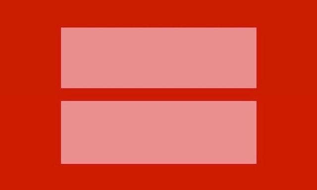
Last week, social networking sites like Facebook and Twitter lit up red as millions of users switched their profile photos to the latest variation of the iconic Human Rights Campaign equal sign.
It was a momentous week for the Human Rights Campaign and for the LGBT community. On March 26, the Supreme Court heard arguments for and against Prop 8, the California law that bans same-sex marriage. On March 27, the Court turned its attention to the Defense of Marriage Act (DOMA), a federal law that defines marriage as a union between a man and woman.
The LGBT rights movement has a long and notable history of using symbols and color to represent its cause.Beginning in the Victorian era, gay men wore green carnations as an understated form of identification through which they could recognize one another. Oscar Wilde was known for wearing one in his lapel.
During the early twentieth century, red accessories such as ties and cravats succeeded the green carnation. Red eventually became famous as the color representing AIDS awareness.
The pink triangle, today a well-known symbol of the gay liberation movement, has its origins rooted in tragedy and human cruelty. It was first used in Nazi concentration camps to designate homosexual prisoners.
In the 1970s, the movement reclaimed the pink triangle, and a decade later, the AIDS Coalition to Unleash Power (ACT-UP) chose it as their symbol, turning its point upwards to indicate an active fight.
At around the same time, San Francisco artist Gilbert Baker created the movement’s famous rainbow flag in 1978 as a symbol to be used every year in the San Francisco Gay and Lesbian Pride Parade. Each color in the flag represented a different facet of gay and lesbian life. Today, it is an internationally recognized symbol of gay pride.
The Human Rights Campaign equal sign, traditionally yellow with a navy background, is similarly recognizable, though it is important to note that HRC is a group focused primarily on marriage equality and does not represent the views of all lesbian, gay, bisexual, and transgender individuals.
The unembellished but bold design was created by marketing firm Stone Yamashita as a means of furthering a unifying message for the organization. HRC spokesperson Charlie Joughin explained that last week’s switch to red was because red is a symbol for love.
Last Friday, the Supreme Court justices met to make preliminary decisions on the outcomes of the week’s cases. Right now, it appears that the justices are leaning toward dismissal of Prop 8, and the pivotal decision on DOMA rests with Justice Kennedy as the liberal and conservative judges are evenly split.
The ambiguous position of the judges is a disappointment to many. However, equal rights advocates can take a certain degree of comfort in knowing the public and political attitude toward same-sex marriage has shifted dramatically and quickly in recent years. Right now, support is as high as 70 percent among the millennial generation.
Let us hope that in the months before the Supreme Court makes its final rulings””most likely in June””the justices recognize the importance of equality that most of our country already has. And in the meantime, let your rainbow flag fly.
 About the Writer
Lane Florsheim is a senior at Tufts University where she is studying International Relations. She loves writing and reading about culture, politics, and women’s issues. Lane delights in jewelry making, captivating novels, and travel and exploration. Her personal website is available here. Follow Lane on Twitter @laneflorsheim.