
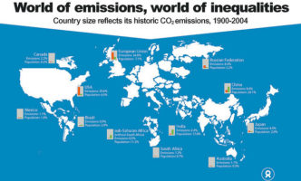
This interactive climate change map on New Scientist shows how average temperatures in specific locations all around the world have changed over the past 120.
As you can see, New York is getting its fair share of heated results from greenhouse emissions:
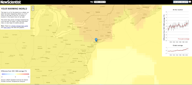

Check out how the region you live in is being affected here.